Data Viz Presentations and Tools
Overview
Today we'll present the story ideas and visual sketches from our last assignment.
We'll also begin exploring a pair of tools that can help us easily publish visualizations to the web.
Assignment 8 Presentations
As mentioned in the class exercise on Tuesday, each group was assigned one of three data sets:
- Campaign Finance data - Use the data viewable on the linked web page (as opposed to drilling down into the individual filings or downloading filing data)
- Death Penalty Info Center executions
- Stanford Open Policing Project - Download the data from Stockton (CA), which has a reasonable amount of rows and data attributes available
For your presentations, you should:
- Describe the story questions you chose for the data set
- Identify the field(s) that you used to visually explore the questions. This should include a basic description of the data types involved (e.g. a nominal categorical variable or discrete quantitative variable). It's fine -- and often necessary -- to generate new variables for the purpose of analysis (e.g. aggregating a count of campaign contributions by candidate). You should explain if this type of data summarization is necessary for the analysis, and describe the generated fields and data types.
- Select one or more chart types appropriate for a visual analysis of the questions, and explain which you believe is most appropriate and why (specifically making reference to the fields and data types).
- Create hand-drawn sketches of your charts.
- What interactive features could you add to the charts? Annotate your hand-drawn sketches to illustrate the feature (e.g. a tooltip on hover over a bar chart).
Assignment 9
A myriad of visualization tools and platforms are available these days, each with different pros and cons. Some require a fair degree of coding knowledge (e.g. D3), but in turn provide a high degree of flexibility. Others offer a much lower bar to entry, allowing you to simply upload data, create a chart, and publish it.
Newsrooms often lean on both types of tools. A simple chart based on straight-forward data is often an appropriate, time-saving option -- even if you have coding skills.
For this assignment, we'll explore the world of data visualization tools and get our hands dirty using two "freemium" platforms for easily creating and publishing charts.
Here are the details:
Read
Code
- Sign up for Datawrapper and Flourish.
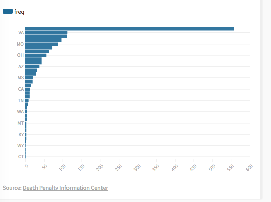
- Create a bar chart in both Datawrapper and Flourish using the state breakdown of death penalty executions. The chart should look like this:
- Publish/export the chart.
- Embed an iframe for each chart in the appropriate spot in a file called
index.html, with the below HTML:
<!DOCTYPE html>
<html>
  <head>
    <meta charset="utf-8">
    <meta name="viewport" content="width=device-width, initial-scale=1.0">
    <title>Death Penalty Executions</title>
    <style>
    h2, h3, p#overview {
      text-align: center;
    }
    h2 {
      font-size: 1.875em;
      margin-bottom: 20px;
    }
    h3 {
      font-size: 1.275em;
      margin-top: 50px;
      margin-bottom: 20px;
    }
    p#overview {
      font-size: .875em;
    }
    </style>
  </head>
  <body>
    <h2>Death Penalty Executions</h2>
    <p id="overview">Visual embed examples using Datawrapper and Flourish.</p>

    <h3>Embed code from Datawrapper</h3>
    <!-- Datawrapper iframe goes here -->

    <h3>Embed code from Flourish</h3>
    <!-- Flourish iframe goes here -->
  </body>
</html>- Publish the
index.htmlfile to your class website at the following URL:https://mysite/executions/. Remember, this will require creating a directory in the_site/folder of your class repo, and then publishing the file and busting cache:
cd /path/to/class-repo
pipenv shell
mkdir _site/executions/
touch _site/executions/index.html
# Add the HTML mentioned above with the iframes for
# Datawrapper and Flourish charts
invoke deploy
invoke cachebust- Upload the URL to your completed file (e.g. https://mysite/executions/) to Canvas.
- IMPORTANT: Add a link for the published HTML page to the top of your
DataVizTools.mdmemo (see below for details).
Reflect
After completing the Datawrapper and Flourish visualizations, write a short memo (no more than 500 words) describing what you liked about each service and what features could be added or improved.
Here are some important requirements for completing the assignment:
- This memo should be a markdown file called
DataVizTools.md. - The memo should be created in the root of your class website Github repo.
- Include a link to your published HTML file at the top of
DataVizTools.md. - Commit and push the
DataVizTools.mdto your class site Github repo. - Submit a direct link to the
DataVizTools.mdmemo on Github via Canvas.